INTERMEDIATE PAINTING CLASS: Tues Apr 9, 16, 23, 30, May 7, 14

LET’S PAINT!

Are you finding working alone a bit challenging? Would you like the camaraderie of a painting group, and also wish you had some technical assistance to carry out your artistic goals? This could be the class for you!

Each three-hour session begins with a lesson or focus of study designed to expand your painting knowledge. The remaining two hours you will be given time to develop your own painting project, with tips and guidance from your instructor. Acrylic or oil.

Pre-requisite: Painting for Beginners or equivalent experience

Registering now:

INTERMEDIATE PAINTING

Six sessions: Tues 4-7pm

Apr 9, 16, 23, 30, May 7, 14

Location: Val Nelson Studio, 228b-2270 Cliffe Ave, Courtenay, BC

Fee: $425

TO REGISTER: Please email val@valnelson expressing your interest.  Payments made via E-transfer to : val@valnelson.ca 778-865-2650

Cancellation policy: Please provide 7 days’ notice if you need to cancel, at which point you can receive a credit toward a future class.

SUPPLY LIST

Bring your usual materials such as paints, brushes, preferred palette, mediums (if any). No turpentine please for oil painterss (odorless mineral spirits good). Easels, tables are provided.

Please also bring to each class a practise canvas or primed (gessoed) canvas pad sheet 16×12 or 8×10″ for our one hour painting study.

Please bring your own project to work on for the remaining two hours.

Paint Colors: Bring what you have. I like bare minimum to have these: Titanium white, medium yellow or light yellow, yellow ochre, quinacrodone red, ultramarine blue, burnt umber, pthalo green

THE PAINTED PORTRAIT

I will be demonstrating a copy of a 16th century anonymous master for the Chemainus Art Group next week. I did this open acrylic study on cardboard to prep for that. I used a very limited palette: Titanium white, yellow ochre, cadmium red, and raw umber, similar to the Zorn Palette but replacing black with the warmer umber. It’s fascinating to see how much range you can achieve with only four colours.

Manet and In the Studio

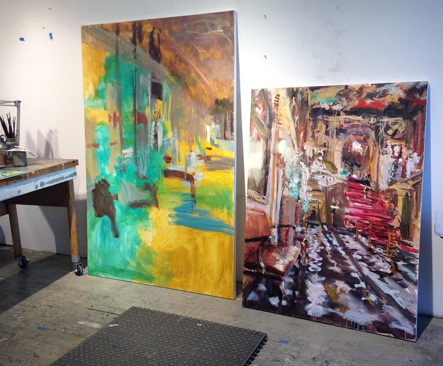
This is something I’m working on right now. It’s the interior of a bistro I fell in love with on Rue Oberkampf in Paris. I really enjoyed the zing of colour of the fruit, and the play of morning light bouncing around on various surfaces. And of course the fuschia pink bar stool are très française. At right are gleaming bottles and glassware which will be really fun to paint when I dive back in to finish this.

Initially I made a smaller version of this painting, but realized the subject warranted a bigger scale for a more immersive experience.

The new canvas is 24 x 32 inches. This is not a custom size you can find off the rack at the art supply store, so my darling man cut down a 24 x 36 canvas for me.

I like to use a grey palette at this stage, so I can see how highlights stand out against that midtone. The final hits on the painting are usually the lightest lights, and the darkest darks. I am nuts about the in-between colour mixtures that you can’t quite name, the “greyed down” colours which help the brighter colours sing out.

As usual this is a process through which the painting will eventually tell me what it wants to be, and the meaning comes through the making.

When I see this kind of setting, I can’t help but think of Manet’s brilliant painting A Bar at the Folies-Bergère which he painted in 1882. I dare not compare my work to his, but I am certainly inspired by his lush use of thick paint, and his ability to strategically choose what to emphasize in the composition. This is exceptionally sophisticated art-making.

https://courtauld.ac.uk/gallery/collection/impressionism-post-impressionism/edouard-manet-a-bar-at-the-folies-bergere

I was fortunate to be able to view this painting first-hand at the Courtauld Institute in London. This is from the institution’s website:

This painting was Manet’s last major work. It represents the bustling interior of one of the most prominent music halls and cabarets of Paris, the Folies-Bergère. The venue opened in 1869 and its atmosphere was described as “unmixed joy”. In contrast, the barmaid in Manet’s representation is detached and marooned behind the bar.

The Folies-Bergère was also notorious as a place to pick up prostitutes. The writer Guy de Maupassant described the barmaids as “vendors of drink and of love”.

Manet knew the place well. He made a number of preparatory sketches there but the final work was painted in his studio. He set up a bar and asked one of the barmaids, Suzon, to serve as his model.

The painting was first exhibited in 1882, at the annual fine arts exhibition in Paris, the Salon. Visitors and critics found the composition unsettling. The inaccuracy of the barmaid’s reflection, shifted too far to the right, has continued to spark much debate.

To my mind, good painting that stands the test of time needs to be aesthetically captivating to keep the viewer’s attention (it is visual art after all), but also open to a number of interpretations that cannot be locked down.

However as humans we are captivated by story; we are compelled to know more.

It is possible that he was directly pointing to the barmaid being just another seductive object for consuming with one’s gaze–notice the two round white electric globes flanking her, echoing the lens of binoculars held by a woman in the crowd.

Manet was also known to be an admirer of the work of Spanish court painter, Diego Velàsquez. A similar contradictory space and perplexing riddle are present in Velàsquez’ Las Meninas.

https://www.museodelprado.es/en/the-collection/art-work/las-meninas/9fdc7800-9ade-48b0-ab8b-edee94ea877f

The painter is looking out at the scene he is creating. Like in Manet’s Bar scene, in the spotlight here is also a beautiful female wearing a corsage on her breast. She looks out at us, while her courtiers attend her. At back is a also a mirror, this time reflecting the images of the king and queen who in this space would seem to be in the studio but only apparent through their reflection. Their physical presence is only implied, and is outside the frame. In the 17th century, when this was painted, the young princess was being groomed to be the wife and queen in a politically arranged marriage to further the power of the Spanish monarchy. So she too is merely an object for trade. Everyone here has their role to play, and know their place.

But although it would appear that all is luxury and ease, the Spanish monarchy was in fact crumbling and its King, Philip II who was Velasquez’ patron, was a weak ruler. One could say that Velàsquez was a skilled propaganda artist. The fact that he painted himself into this image may suggest he is saying directly to future viewers of his masterpiece, “I painted this, and I knew what was actually going on.”

Velàsquez, an avid reader of philosophy, knew that creation is alchemy. We artists conjure our own realities through the power of our imaginations, with the skills of our hearts, minds, and hands.

C’est cool, non?

A bientôt, Val

Haptic Splendour

For the past 15 years, I’ve painted opulent European 18th and 19th century interiors. Designed as theatrical displays of status and power by wealthy aristocrats and bourgeoisie, these formerly private sites are now museums, providing entertainment and pleasure for touristic consumption, while also opening up a space for philosophical contemplation.

Although I use photography as a structural device through which I enter the painting process, with each piece I always seem to arrive at a point of crisis where I need to break free from the tyranny of the image. Through partly destroying the image I discover fresh solutions to painterly problems I set for myself.

Throughout my childhood and into my mid-twenties, I was a ballet dancer. That intense training of spatial awareness and interpretive questioning is still deeply stamped in my DNA. A painting to me is a kind of choreography; there’s a haptic dance that takes place from my optical experience of an image, through to the way my nervous system signals to my body how to translate and record it. As painter/dancer I tease out meaning through working and reworking, coming up to speed as I gain understanding, and making the last strikes with absolute commitment.

Talking objects

Below are images of a work shown in progress through to completion, of the Porcelain Dining Room in the Chateau de Versailles. It’s a commission I’ve enjoyed making for a private home near Toronto.  The wide panoramic format was pieced together from individual photographs I took from a trip in France a number of years ago. I remember going through the chateau twice, the second pass offered a satisfying, golden afternoon light. The composition reminds me of the forced perspective one observes on the virtual tours of museum websites.

Porcelainpanorama-studioshotinprogress

Porcelainpanorama in progress
Day 3, Porcelain Panorama (working title), 36 x 72 inches, oil on canvas

Blocking in always begins with big brushes, to locate everything and establish colour family and main values. The next step in the painting is to use smaller brushes and go in for specifics of detail, sharpening edges and creating stronger focal points. I want the viewer to feel immersed in the space, with lots to encourage the eye to keep meandering, discovering new subtleties and maybe even surprises. It’s important to me that a painting unfold for the viewer slowly, to withstand the test of time.

In the final session something happened that wasn’t planned. Here’s the finished piece with its new title, Mantlepiece with Talking Objects (Versailles).

Mantlepiece-with-talking-objects(Versailles)-FINAL
Mantelpiece with talking objects (Versailles), 36 x 72 inches, oil on canvas, 2016

Working with the warm colors of the parquet flooring, gilding, and marble, really helped energize the gray days of winter.

porcelainpanorama-palette


In the Studio: June

I’m really enjoying the possibilities of rococco and baroque interiors again. The over-the-top opulence of these spaces allows me to not feel too precious about their forms, so I can play freely with mark-making and a combination of drawing/painting that is so directly connected to the way I draw.

Nelson_Stutter_web
Stutter, 36 x 48 inches, oil on panel, 2013

Nelson_Echo_web
Echo, 30 x 40 inches, oil on canvas, 2013

Actually this is French Empire style–from Napoleon’s country home just outside of Paris.

Nelson_Skirmish_web
Skirmish, 36 x 48 inches, oil on canvas, 2013

Interim pieces in the studio

I’m working on a few interim pieces before I take a summer break–two weeks in LA and San Francisco, to visit friends and look around. I always love to go the the museums and galleries and see what’s going on. Looking at great art really refuels my inspiration.

Last week I did a demo for my painter friends Sylvia and Arlene. They wanted to see how I start a painting.

I start with the general (the big shapes) and try to get the colour-world and values more or less established within the first couple of hours. I love this first step, from nothing to… hopefully something.

IMG_0749startingapainting_web IMG_0758startingapainting

IMG_0764workinprogress_webOn subsequent sessions I move slowly toward the particular, (the details.) But I hold back a while and sneak up on them. Getting too detailed too soon tends to lock in the image and give me nowhere to move to. So I like to leave lots of options available at first.

IMG_0790Stutter_workinprogress
End of first two hours, blocking in the forms

In the Studio: September

Working from photography is a little dull these days. What I seem to need to do right now is paint what’s in front of me. The underpainting for the piece below was a failed experiment in acrylic from the summer of 2011, which lay dormant in the storage rack all this time. If it’s dry by tomorrow, it will be off to the Toronto International Art Fair. You may see it at the Bau-Xi Gallery booth on the Preview Night, October 25.

The piece below was inspired by 19th century Berlin artist Adolph Menzel’s drawing of a bookcase I sawin my excellent Michael Fried book on the artist.

The Bookcase, 60 x 48 inches, oil and acrylic on canvas, 2012

In the Studio: August

Hand study

Inspired by the paintings and drawings of hands and feet by Adolph von Menzel I saw recently in Berlin, I decided to do one myself. A fascinating study of those weird appendages we may not really think about much in our day to day busy-ness. The longer you look the more strange and wondrous they appear.

Adolph von Menzel, The Artist’s Foot, 38.5 cm (15.16 in), Width: 33.5 cm (13.19 in), oil on wood, 1876