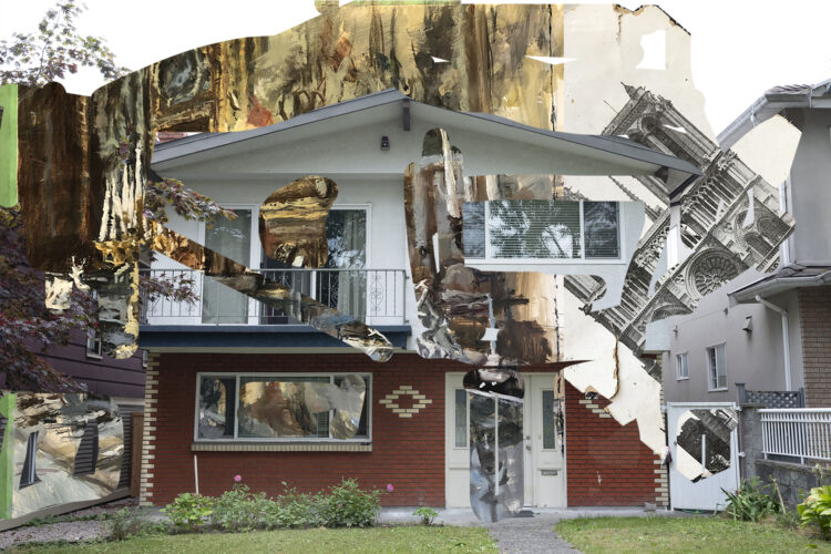
I’m honoured to be included in Duct Tape Gallery’s “Vancouver Special”, a collaborative project in which twenty-eight Vancouver artists were invited by Vancouver photographer Mark Mizgala to artistically alter one of his photographs of a Vancouver Special house.
Photographic prints of the project will be shown and available for purchase in an exhibition at Duct Tape Gallery on September 19-21, as well as copies of the Mizgalas’ Duct Tape magazine, Edition 3, whichserves as a catalogue of the show.
The Theme: The origins of the Vancouver Special can be traced back to the post-World War II era, when Vancouver experienced a significant population boom due to immigration and returning veterans. This led to the need for quick and cost-effective housing solutions, and is being reconsidered today as a potential solution to housing crunch in the city.
237 East 4th Avenue, East Vancouver
Parking: On weekends there is often parking along 3rd and 4th Avenue, between Main and Cambie, and sometimes along Great Northern Way as well, between Main and Brunswick.
The exhibition continues through September 21, Mark will give a public presentation of the work on Friday, September 19th, Saturday September 20th and Sunday September 21st.
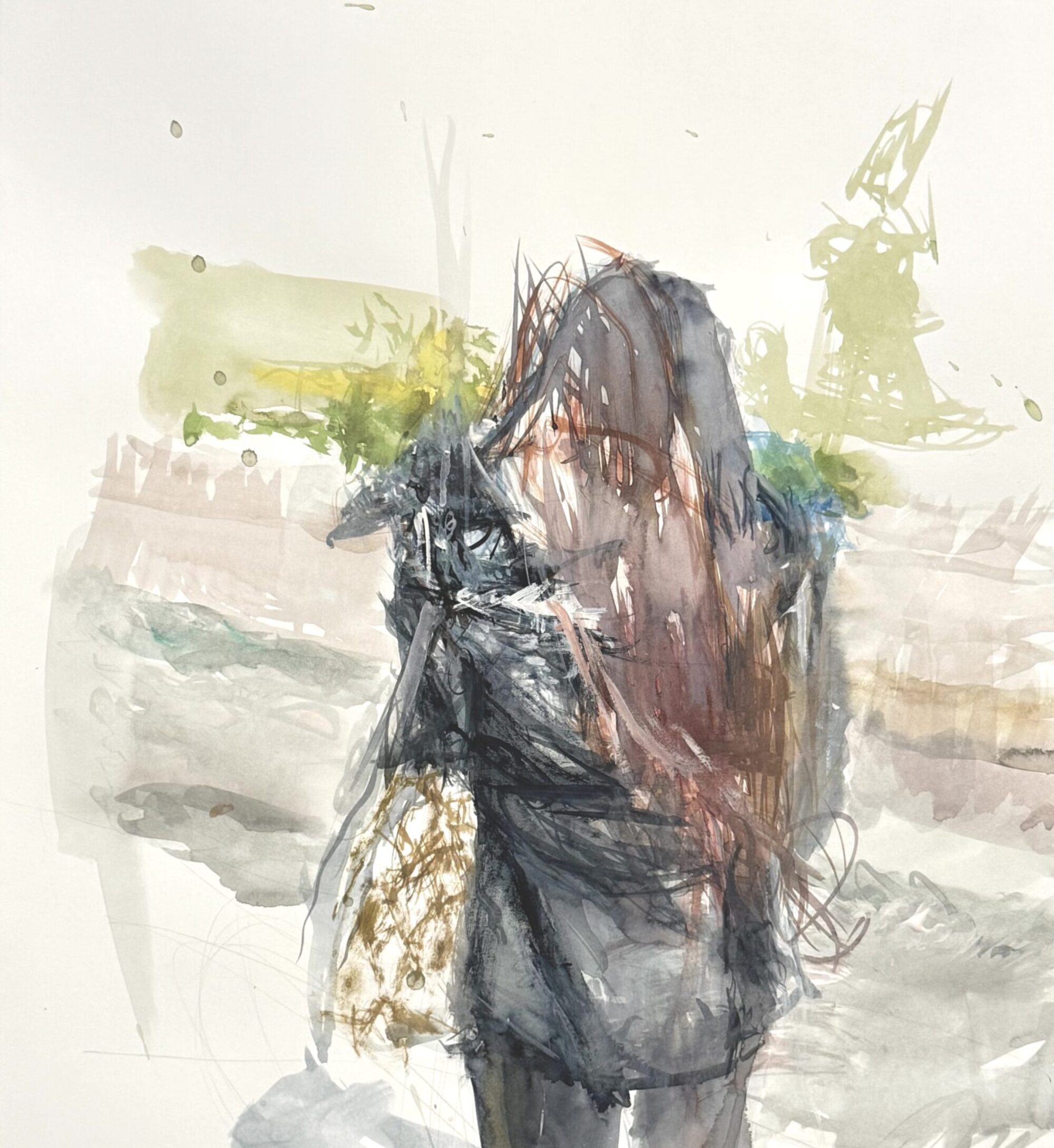
This is something I’m working on right now. It’s the interior of a bistro I fell in love with on Rue Oberkampf in Paris. I really enjoyed the zing of colour of the fruit, and the play of morning light bouncing around on various surfaces. And of course the fuschia pink bar stool are très française. At right are gleaming bottles and glassware which will be really fun to paint when I dive back in to finish this.
Initially I made a smaller version of this painting, but realized the subject warranted a bigger scale for a more immersive experience.
The new canvas is 24 x 32 inches. This is not a custom size you can find off the rack at the art supply store, so my darling man cut down a 24 x 36 canvas for me.
I like to use a grey palette at this stage, so I can see how highlights stand out against that midtone. The final hits on the painting are usually the lightest lights, and the darkest darks. I am nuts about the in-between colour mixtures that you can’t quite name, the “greyed down” colours which help the brighter colours sing out.
As usual this is a process through which the painting will eventually tell me what it wants to be, and the meaning comes through the making.
When I see this kind of setting, I can’t help but think of Manet’s brilliant paintingA Bar at the Folies-Bergère which he painted in 1882. I dare not compare my work to his, but I am certainly inspired by his lush use of thick paint, and his ability to strategically choose what to emphasize in the composition. This is exceptionally sophisticated art-making.
I was fortunate to be able to view this painting first-hand at the Courtauld Institute in London. This is from the institution’s website:
This painting was Manet’s last major work. It represents the bustling interior of one of the most prominent music halls and cabarets of Paris, the Folies-Bergère. The venue opened in 1869 and its atmosphere was described as “unmixed joy”. In contrast, the barmaid in Manet’s representation is detached and marooned behind the bar.
The Folies-Bergère was also notorious as a place to pick up prostitutes. The writer Guy de Maupassant described the barmaids as “vendors of drink and of love”.
Manet knew the place well. He made a number of preparatory sketches there but the final work was painted in his studio. He set up a bar and asked one of the barmaids, Suzon, to serve as his model.
The painting was first exhibited in 1882, at the annual fine arts exhibition in Paris, the Salon. Visitors and critics found the composition unsettling. The inaccuracy of the barmaid’s reflection, shifted too far to the right, has continued to spark much debate.
To my mind, good painting that stands the test of time needs to be aesthetically captivating to keep the viewer’s attention (it is visual art after all), but also open to a number of interpretations that cannot be locked down.
However as humans we are captivated by story; we are compelled to know more.
It is possible that he was directly pointing to the barmaid being just another seductive object for consuming with one’s gaze–notice the two round white electric globes flanking her, echoing the lens of binoculars held by a woman in the crowd.
Manet was also known to be an admirer of the work of Spanish court painter, Diego Velàsquez. A similar contradictory space and perplexing riddle are present in Velàsquez’ Las Meninas.
The painter is looking out at the scene he is creating. Like in Manet’s Bar scene, in the spotlight here is also a beautiful female wearing a corsage on her breast. She looks out at us, while her courtiers attend her. At back is a also a mirror, this time reflecting the images of the king and queen who in this space would seem to be in the studio but only apparent through their reflection. Their physical presence is only implied, and is outside the frame. In the 17th century, when this was painted, the young princess was being groomed to be the wife and queen in a politically arranged marriage to further the power of the Spanish monarchy. So she too is merely an object for trade. Everyone here has their role to play, and know their place.
But although it would appear that all is luxury and ease, the Spanish monarchy was in fact crumbling and its King, Philip II who was Velasquez’ patron, was a weak ruler. One could say that Velàsquez was a skilled propaganda artist. The fact that he painted himself into this image may suggest he is saying directly to future viewers of his masterpiece, “I painted this, and I knew what was actually going on.”
Velàsquez, an avid reader of philosophy, knew that creation is alchemy. We artists conjure our own realities through the power of our imaginations, with the skills of our hearts, minds, and hands.
I’ve finally completed the painting above “Paris in Springtime”, which I have been working on for at least a couple of years now, off and on.
Engaging myself in the studio this summer helps me remember fondly my times spent in the city of many greys.
Right now I’m thinking back to Paris, where I was in May of 2017…
Because I would soon be teaching a painting workshop in Tuscany, and I hadn’t painted very much at all since the car crash, I wanted to get back into the groove by painting from life. I had brought with me a great plein air setup which involves a Strada paintbox recommended by fellow Vancouver painter Marie Josenhans. You can attach it to a standard camera tripod.
I laid out some oil colours in the paintbox, and with excitement set out early one morning to the beautiful Père Lachaise Cemetary. As I was unfolding my tripod, an official came by and insisted I take it down. It was the “regles” or rules: no tripods in the cemetary. I pondered what might be the reason for this–perhaps because I might kill some ghosts? Ha ha ha!
At any rate, I was not going to not paint this fantastic place, so I put the tripod away, and placed my paint box on a tombstone, working quickly before the light changed too much. Similar to when I draw, I felt like my paint brush was actually touching what I was looking at––the surfaces of the stones, the textures of the leaves and grasses as they shimmered in the early morning breeze.
Which brings to mind a quote from a book I love, All the Light You Cannot See by Anthony Doerr. This stunningly beautiful story is about a blind French girl and a German boy whose paths collide in occupied France as both try to survive the devastation of World War II.
In the early chapters of the story, little Marie-Laure accompanies her father to his place of work, the Museum of Natural History in Paris. She loves to explore the fascinating collections of nature specimens there.
“To really touch something, she is learning—the bark of a sycamore tree in the gardens; a pinned stag beetle in the Department of Etymology; the exquisitely polished interior of a scallop shell in Dr. Geffard’s workshop—is to love it.”
As the German troops force her and her father to flee the city into the countryside, she experiences many difficult realizations about the evils that humankind can inflict on others:
“This, she realizes, is the basis of all fear. That a light you are powerless to stop will turn on you and usher a bullet to its mark.”
Werner, an innocent young German boy with a natural talent for fixing electronics, has a dream to be a scientist, falls guilelessly into serving Hitler’s military as a wireless radio operator.
The painterly prose generates great empathy for both protagonists by helping us understand how two people can be caught in the middle of a conflict that neither have asked for. I think I can honestly say it’s one of the top ten novels I’ve read in my life.
Another painting project I really wanted to do was a portrait study in oil of Stella Libert, a talented cinematographer I had met through my Canadian-Parisian friend Dana Wyse. Stella agreed to sit for me in her lovely petite apartment not too far from the Père Lachaise.
I’m really glad I took a photo of the study, because when we reconvened a few days later for another sitting, I couldn’t make it better, and in fact it actually lost something in the process. So I eventually painted over it.
Merde!
Oh, excusez-moi.
Sometimes a study is just meant to be what it is: a recording of the process of looking. It doesn’t have to be “finished”. So you painters out there, be okay not to censor yourself! Your initial impulse may contain some of the best of what is unique to you. Keep those studies hanging around, they may remind you of what you are capable of.
By the way, below you can see a beautiful short film made by Stella called “Paris Je T’Aime”, which artfully follows two parkour artists over the rooftops of Paris as they break the “regles” through exerting their freedom to defy gravity.
And here is a bonus little segment that shows Stella at work directing and filming it. Très cool:
I was supposed to be in Paris with my sweetie in March this year, but we had to postpone our trip almost at the last moment when the global pandemic developed with such surprising speed. Since we won’t be going anywhere for a while, I’ve decided to share with you some events from my five week dream stay in Paris in 2017.
What made the trip extraordinary was that there was a very real chance it could never happen.
In late summer of 2016 I made my plan: I’d wake up in Paris on April 1 (my birthday), live six weeks in Paris “like a Parisian”, then move on to teach a two-week painting workshop in Tuscany. Then I’d wrap up my trip by meeting a friend to see the Venice Biennale. Très excitant!
Everything was on track: I had ramped up my entrepeneurial chops by meeting my financial goals through selling my art; my Tuscan painting holiday was close to fully booked; I had bought my air ticket to Paris, and booked an AirBnB for a really great price.
Ooh la la, I was stoked. I was so amazed that I was making this dream a reality. But I was a bit tired from all this activity. So I took a little break in California to get some sunshine. This is me practicing plein air in Palm Desert on November 29.
On November 30 came the car crash.
Oops.
Rush Hour 3
The next several months I spent convalescing. I had a concussion, a broken clavicle (my painting arm), major whiplash, and for a while I had difficulty walking. And I couldn’t paint. Argh. I lay awake unable to know what to do. Should I cancel my trip?
Self-portrait with broken clavicle
It was my dark night of the soul. Since I couldn’t be in the studio, and I love making the most of my time, I thought it would be a good idea to work on my “art career”. When I began working with two different life coaches, it became obvious that what I really needed to address was some deep stuff within myself. So I spent the winter in meditation, and began sorting it all out.
Bubble
By mid-March, even though I couldn’t yet lift my suitcase, my doctors and physiotherapists deemed me well enough to go to Europe. Hurray! I could spend some of my convalescence in Paris––pas mal, non? I figured sitting in some cafés, looking at art, and maybe making a few drawings should be fine, and I would likely be much stronger by the time I got to do the working portion of my “holiday” in Italy, so things were looking pretty rosy.
Then, the vertigo kicked in. Or what I later learned is actually something called “disequilibrium”. But more on that later.
At any rate, I was still able to leave for France only two weeks later than planned.
Charles de Gaulle airport
When I arrived on a sunny mid-April afternoon and found my new home in the 11th arrondissement, I remembered that I had booked my accommodation the previous fall knowing full-well that there was no elevator. And my suite was on the sixth floor. That’s one of the reasons it was so cheap!
Although I usually like to travel light, my suitcase this time was extra large because of the length of my stay, and the fact that I had brought along art supplies for my upcoming painting workshop. Because I had been in “business” mode for four months, I also had foolishly brought along office supplies, including a stapler that must have weighed nearly half a pound! What was I thinking? Okay, I’ll give myself some slack, I was after all recovering from a concussion.
Needless to say, there was no way I was going to be able to get my stuff up there the normal way. So I treated the ground floor like base camp, and gradually decanted things up the long spiralling staircase over several stages.
The place was pretty tiny, and obviously they’d got most of their decor from Ikea. But I was in Paris!
Stay tuned for more Parisian adventures in my next installment. Meanwhile, I thought I’d pass along a tip on a très charmant online show I’ve been escaping into lately during the coronavirus pandemic. It’s called Little Paris Kitchen, hosted by Rachel Khoo, a young British Cordon-Blue trained chef who demystifies French cooking for us in her tiny Paris flat. She turns her little place into a restaurant at night that can only seat two people at a time! You can find it on CBC Gems and watch it for free.
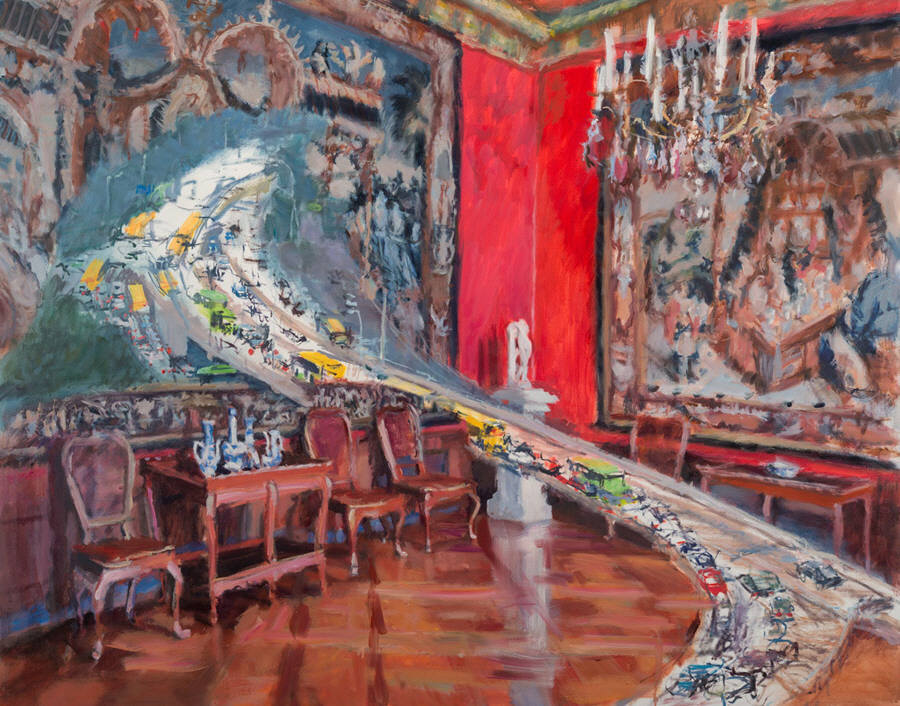
See paintings, sculptures, and ceramics from our Permanent Collection that “flow” in different ways. (Featured image: Val Nelson, Rush Hour 2 (2014), oil on canvas, 122 cm x 152 cm. Collection of Surrey Art Gallery, gift of the artist.)
Our world is marked by the ever-present movement of peoples, products, and ideas over vast distances and at rapid speeds. These movements and transmissions dictate the limits of life, the energetic potential of nature, the dynamics of economies, and the transformative potential of society and individuals.
Sara Graham, Thornton Rail Yard, Surrey #4 (2015), mixed papers and silicone glue.
Drawing from Surrey Art Gallery’s permanent collection, the over two dozen artworks presented address numerous themes, including transnational migration, the circulation of information and data, the force of waterways and weather systems, the physical movement of human bodies, and the transportation of materials and products to market by rail or by foot.
Some works, like Val Nelson’s painting Rush Hour 2 (2014), draw attention to the flow of people in our cities. In particular, Nelson’s work examines the relationship between the congestion of our roadways with our culture’s enthusiasm for grand detached homes and single-occupancy vehicles. Delving more into the movement of goods, Sara Graham’s Thornton Railyard, Surrey, BC (2015) uses miniature filigreed collage techniques to depict the contours and history of movement of one of British Columbia’s largest rail yards.
Brendan Tang, Manga Ormolu Version 4.1-a (2009), ceramic clay and mixed media.
Soheila Esfahani’s The Immigrants: Homage to F.H. Varley (2015) reimagines a classic image of new immigrants arriving in Canada as seen in Varley’s c.1922 painting with found blue and white porcelain plates and custom ceramic decals. Brendan Lee Satish Tang’s brightly coloured clay vessel Manga Ormolu Version 4.1-a (2009) combines stylistic elements from Ming Dynasty era ceramics with techno-pop robotic elements reminiscent of Japanese anime, manga, toys, and video games. Out of Tang’s vessel gushes a black pumice-like ectoplasm meant to evoke both nineteenth-century spiritualism and twentieth-century science fiction. The potential for gushing black liquid of another sort is seen in Edward Burtynsky’s large-scale photographs showing shiny steel liquid natural gas pipelines zig-zagging across British Columbian landscapes.
The wide variety of images and objects make visible some of the most central conflicts and issue of our time.
The opening reception is the evening of April 14th.
We hope that you will be able to join us for the opening and post-opening gathering later that same evening.